


A great product and beautiful website won’t matter if your user flow is broken. In eCommerce, user flow refers to the step-by-step journey users take — from landing on your site to completing a purchase. A poor user flow causes friction, confusion, and high drop-off rates.
In this article, we’ll walk through the 12 most common user flow mistakes in eCommerce — and how to fix them to increase conversions, improve usability, and boost customer satisfaction.
1. Dead-End Product Pages
The Problem: When a product is out of stock or discontinued, the page offers no alternative (no related products, no “notify me” option). Because of this, users bounce instead of staying to browse alternatives.
How to Fix This:
- Include related or recommended items and a restock notification form to keep users in the flow.
2. Unclear Starting Points for Shoppers
The Problem: Users land on your site and don’t know where to go next. There’s no clear headline, CTA, or navigation path.
How to Fix This:
- Use clear, visually prominent CTAs like “Shop Now,” “View Collection,” or “Add to Cart”
- Highlight featured products or categories on the homepage
- Guide users with banners, hero sections, or onboarding messages
3. Over-Dependence on Search
The Problem: Many sites assume users will search for what they want, but search UX is often poor—misspellings or vague queries return zero results. Users then feel stuck or assume you don’t sell what they need.
How to Fix This:
- Improve search with auto-suggestions, tolerance for typos, and filters.
- Ensure category navigation is intuitive for browsing.
4. Lack of Micro-Conversions
The Problem: Not all users are ready to buy, but there’s no option to engage otherwise (like wishlists, email signups, or product comparisons). You lose users who aren’t ready to commit.
How to Fix This:
- Add soft conversions—like “Save for later,” “Email me when available,” or “Compare” options to maintain engagement.
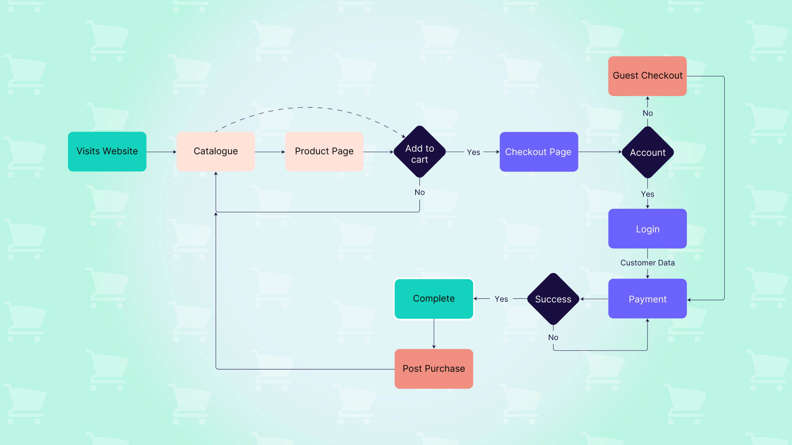
5. Too Many Steps in the Purchase Journey
The Problem: Complex flows with too many clicks or decisions cause fatigue and drop-off.
How to Fix This:
- Consolidate steps in the funnel (e.g., combine shipping and billing into one page)
- Use visual progress indicators during checkout
- Minimise form fields and use smart defaults where possible
6. Confusing Navigation or Category Structure
The Problem: If users can’t easily browse categories or find what they need, they’ll abandon the session.
How to Fix This:
- Group products into intuitive categories and subcategories
- Add filters and breadcrumbs to help with navigation
7. Broken, Looping or Inconsistent Checkout Behaviour
The Problem: Inconsistent design, missing information, unexpected redirects, or getting stuck in a loop (clicking back and forth between checkout steps due to unclear instructions) create anxiety and mistrust. Frustration with this process often leads to drop-offs, especially on mobile.
How to Fix This:
- Use a single-page or linear checkout process
- Keep the design consistent with the rest of the site
- Confirm selections clearly (e.g., shipping method, payment option)
8. Poor Error Handling and Validation
The Problem: When users make a mistake in a form or input, unclear error messages could stop the flow cold.
How to Fix This:
- Display real-time validation messages
- Use clear, helpful error copy (e.g., “Enter a valid zip code”)
- Highlight errors visually with red borders or inline icons
9. No Post-Purchase Flow or Confirmation
The Problem: After buying, users often feel uncertain if the order was placed successfully or what happens next.
How to Fix This:
- Show a clear thank-you page with order summary
- Send immediate confirmation emails with shipping timelines
- Include options to track orders or continue shopping
10. Forcing Users to Create an Account Before Checkout
The Problem: Mandatory account creation disrupts the natural flow and increases abandonment during checkout.
How to Fix This:
- Offer guest checkout by default
- Allow users to create an account after purchase with one click
- Provide social login options for convenience
11. Disjointed Flow Between Marketing and Product Pages
The Problem: If a user clicks an ad or email and lands on an irrelevant or generic page, they’ll bounce.
How to Fix This:
- Create campaign-specific landing pages that match the ad’s messaging and product
- Use dynamic content to personalise the landing page experience
- Keep the flow linear — no unnecessary redirects
12. No Visual Feedback for User Actions
The Problem: If users click buttons and nothing happens visually, they may think the action didn’t register and exit.
How to Fix This:
- Show animations or micro-interactions on key actions (e.g., “Added to Cart” slide-ins)
- Use loading spinners or progress bars for longer processes
- Offer clear transition states between steps
Final Thoughts
A smooth, intuitive user flow is important for guiding shoppers through the journey from interest to purchase. By identifying and fixing these simple mistakes, you can increase conversions, lower bounce rates, and deliver a seamless shopping experience.
Ready to optimise your eCommerce flow?
Whether you’re building a new store or improving an existing one, streamlining the user flow will pay off in customer satisfaction and sales. For expert guidance on improving your existing eCommerce store or building a new one, connect with Greenhat’s team today.